The pieces must work together.
Qualifications matter, but so do leadership style, motivation, company context and the results the business actually needs.
A Mark With More Than 30 Years of History
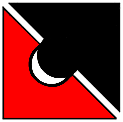
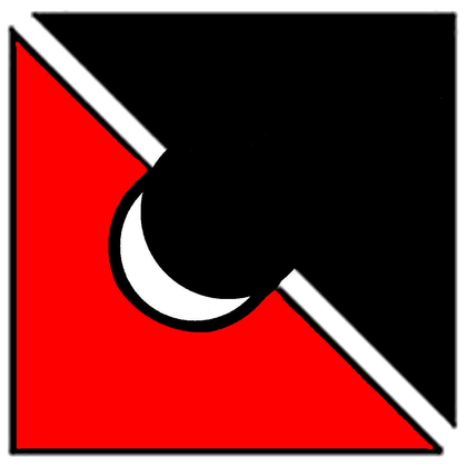
The Precision Placements logo has been with the firm since its inception in 1994. It was designed to say something specific about executive search: the right hire is not simply qualified. The pieces have to fit.
The Original Idea
The two shapes in the logo were created to represent the two sides of an executive search. The lower-left element represents a company with a critical need. The upper-right element represents the candidate capable of filling that need.
The puzzle-piece concept was never meant to suggest that people are interchangeable. Quite the opposite. A successful placement depends on more than matching a title to a resume. The person, the company, the expectations and the timing all have to come together. And the two contrasting colors add another dimension to that idea: the strongest fit does not require two pieces to be alike.
That idea has remained relevant for more than three decades because it still describes the objective of every Precision Placements search: not simply to produce candidates, but to identify the person whose experience, judgment and leadership can create value in a particular organization.
Why “Precision”
The sharper, geometric form reflects Ken Edwards' engineering background and the thinking behind the name Precision Placements. Important hires should not be treated as “close enough.”
Qualifications matter, but so do leadership style, motivation, company context and the results the business actually needs.
The more consequential the role, the more important it is to define the real assignment and evaluate candidates against it carefully.
The red and black pieces remain visibly distinct, yet they fit together to form one mark. The same can be true inside an organization: leaders with different experiences, instincts and ways of seeing a problem can challenge one another, broaden judgment and create a stronger result when the fit is right.
The mark represents a match, but the Precision Placements brand has been built through long-term relationships with companies and executives across the industry.
Difference Without Division
The two halves of the Precision Placements mark do not disappear into one another. One remains red. One remains black. Their contrast is part of what makes the symbol recognizable.
That has become an increasingly meaningful way to think about leadership teams as well. The strongest organizations are rarely built by surrounding a leader with people who think exactly the same way. They are built when different experiences, disciplines and perspectives can come together around a common objective.
For executive search, that does not mean pursuing difference for its own sake. It means being careful not to confuse familiarity with fit. The right leader may strengthen an organization precisely because that person sees something others do not, asks different questions or brings experience the existing team does not already have.
Good fit is not sameness. It is the ability of distinct pieces to work together and make the whole stronger.
Why Keep It
Brands should evolve, and the TextileJobs.com website is evolving with them. But modernization does not require discarding every element of the past.
The puzzle-piece mark has represented Precision Placements from the beginning. Clients, candidates and industry contacts have seen it across more than 30 years of executive search. Its value now comes from both the idea behind it and the continuity it represents.
So the surrounding website, typography, photography and digital experience can become more contemporary while the puzzle piece remains what it has always been: a recognizable symbol of Precision Placements.
Put the idea to work
Every search begins with understanding what the business needs the next leader to accomplish.